Sign up for Free Kaiko Research


Understanding Centralized Exchange Liquidity
Written by Riyad Carey
19/10/2023

Welcome to Deep Dive!
This week we take a step back to explain some fundamental concepts around Kaiko’s liquidity data.


More From Kaiko Research
![]()
Hyperliquid
09/03/2026 Data Debrief
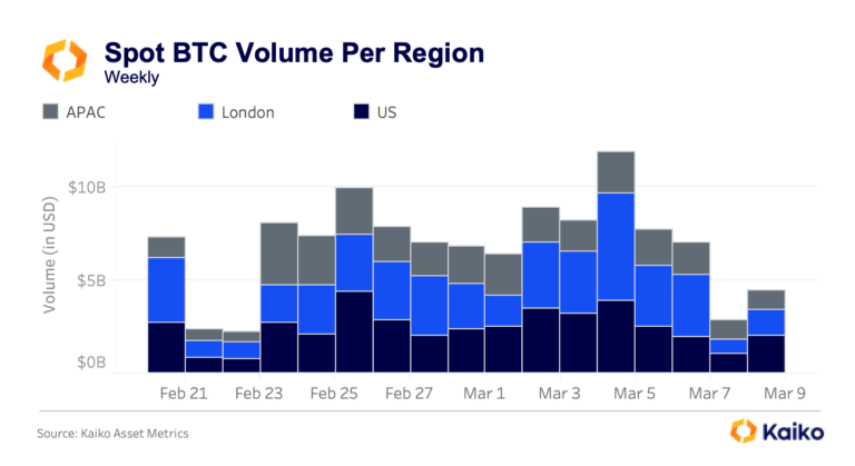
Bitcoin Ranges While Traditional Assets Find New Home on Crypto RailsAs Bitcoin ranges between $60k and $72k following the early February sell-off, the crypto market navigates competing forces, with geopolitical shocks testing 24/7 infrastructure and options markets pricing elevated volatility into the Federal Reserve’s March 18th decision.
Written by Laurens Fraussen![]()
Ethereum
02/03/2026 Data Debrief
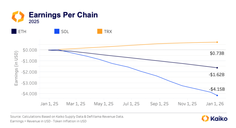
The Pressure of Dilution on Layer 1 ValuationsAs Layer 1 tokens are increasingly traded through ETFs and evaluated like equity investments, the market is discovering an uncomfortable truth, most major blockchains operate as loss-making businesses. With Ethereum posting $1.62B in annual losses and Solana bleeding $4.15B despite generating hundreds of millions in fee revenue, validator dilution costs consistently outpace income by 7-25x.
Written by Laurens Fraussen![]()
Ethereum
23/02/2026 Data Debrief
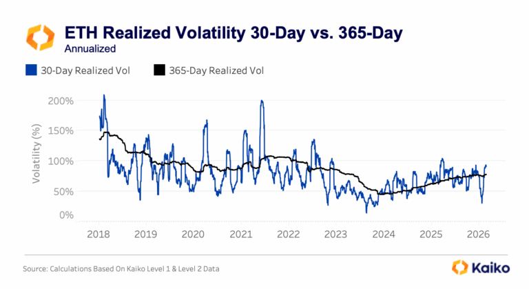
Staking Products Launch Despite Treasury FailuresAs crypto volatility continues, the markets are testing whether institutional ETH adoption follows price or infrastructure development. With ETH plunging 50% from its mid-2025 peaks to $2,000, this triggered a 95%+ collapse in equity treasury vehicles like ETHZilla and $4B in spot ETF outflows.
Written by Laurens Fraussen![]()
Prediction Markets
16/02/2026 Data Debrief
Prediction Markets Liquidity In FocusPrediction markets captured mainstream attention throughout 2025 as Polymarket processed over $2 billion in election-related volume. The post-election collapse from $1 billion to $200 million in open interest exposed fundamental questions about sustainability.
Written by Laurens Fraussen